


On tuesday Etsy released new guidelines, one of which now openly allows artists and designers to use Manufacturing partners to help create an item. Some outside help has always been allowed on the marketplace, like an illustrator having their art work professionally printed on paper at a print shop, or in my case, laser cutting.
With the new guidelines some third party help does not need to be disclosed in your shop, while other help has to be applied and reviewed by etsy, and then disclosed on the item page and the new about us pages. Digital prints and posters, music, books you’ve authored, and 3D printed items do not have to be reviewed if you use a third party for help, but lasercutting now does.
I have already applied for review with my amazing partner, who has helped me grow my business and been my biggest fan as well, Ponoko. Of course, some people don’t see lasercutting as belonging in the “handmade category”, and I think that is just a shame. So I wanted to show you some process photos of one of my new products and show how something is made from start to finish with the help of my amazing partner here in the states, who is just another small business that my small business gets to support! So here we go…
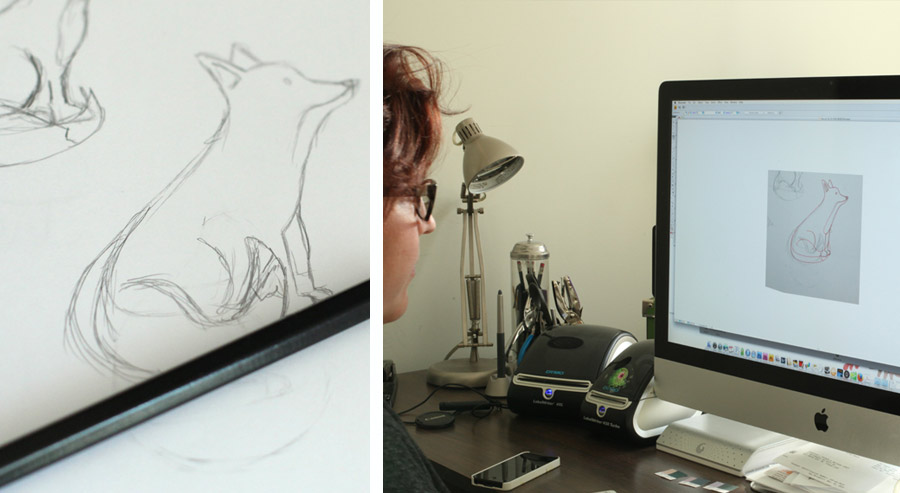
All of my designs start out as just a simple pencil sketch (my design professors would be proud . I then take a photo (who needs scanners anymore) and flush out the idea in illustrator. With this fox brooch I used two colors of brown to envision what would be engraved and what would be natural wood. Once I am happy with the final illustration, I work the illustration into lines that the laser cutter can read, here the Blue lines mean it will be cut – and the black solid areas are places for engraving.
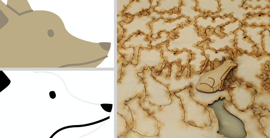
I place the final line art along with other line art, kind of like a really cool jigsaw puzzle, and upload it to Ponoko, where I choose the materials I want to have it made from. Ponoko cuts my art work with their magical lasers and send me exactly what I set to them, except it’s tangible now! They cut exactly what I send them, so if I made a mistake, made a line too short – forgot to close a loop – or made a spelling error – I have to fix my mistakes and make it over again.
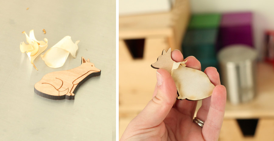
The next step is kind of magical. I pop all of my little creations from the board (i try and arrange things as close together as possible so there is little wasted material. Then I peel the protective paper that helps keep the pieces free from burn marks during the laser cutting.
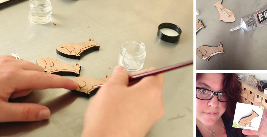
Then I start the finishing process. For my coasters, the wood is sanded slightly and stained and finished, with this new fox brooch, I hand paint him and then paint on a protective seal. Glue on a little pin back and them get him all ready for his new home! I design all of my own packaging (which has become one of my favorite parts of my business).
I love being part of the handmade community! Even though I don’t painstakingly hand carve my work, and I don’t own my own laser cutter a lot of myself goes into everything I make, and I love being able to share my illustrations and creations with people all over the world. I look forward to sharing some new amazing goodies over the next few weeks!


