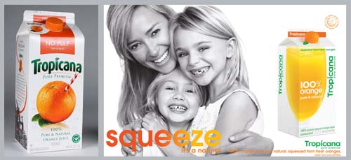
I didn’t hate the new Tropicana packaging, but I also didn’t think it needed to be changed. There was something so iconic about the previous packaging, with that big juicy orange with the red and white straw poking out f it, it just said FRESH & Natural without having to actually say anything. The new packaging was just a little plain jane to me, it is modern, but it doesn’t have any added value, there was nothing special about this orange juice vs any other. I did however have very a very strong opinion about their new ad campaign, I hated it. It is boring, contrived and the copy writing is subpar (what little there is of it). “Squeeze it’s a natural.” Really? who says “It’s a natural?” I think there is a word missing in that sentence.. or maybe there is one word to many. Either way it just doesn’t make sense.
Well for anyone who has felt even a tad bit leery of the new packaging, or maybe you just down right hated it, there is good news on the horizon ( thanks to the NYT ). Tropicana ( run by Pepsico ) is returning to the old packaging. Apparently the public is up in arms about the rebranding, so the company is listening to the people. Now if only we can get more people to express their opinions about things that really matter.


Mannie on February 24, 2009 at 11:35 am said:
I agree with the “new” packaging & slogan. The new look didn’t add anything new; it didn’t make anything any better. And the slogan? What were they thinking? And yes… “Now if only we can get more people to express their opinions about things that really matter.” < DITTO!
♥Mannie
Terrie on February 25, 2009 at 12:50 am said:
Wow. I had noticed this new packaging, but it never occurred to me to notice! Though I DO have to admit that I thought the little orange-shaped cap on the new box was fun (I noticed because I have bought the juice twice in the last few weeks. One had the new and the second didn’t).
A product’s got to have a lot more graphic excitement for me to consider it for much more than a moment, I guess…
But on a tangent, I HAVE noticed that Pepsi’s new logo reminds me a LOT of the Obama campaign logo. To the point I think it was totally intentional. I wonder…… If Pepsi comes out with a new product called “Pepsi Change” or a commercial witha rap type song that goes “Pepsi
s in the House” we’ll know it was true!
peppersprouts on February 25, 2009 at 8:57 am said:
Hey Terrie-
you are actually dead on when it comes to the new pepsi logo. The logo was directly inspired by the Obama campaign logo. Their new tagline is “refresh everything.” if you head over to their site http://www.refresheverything.com/ you can see it is politically fueled, they are asking you to upload an open letter to the president about whatever you want.
you may think its strange for a company to align itself with a political candidate, but Pepsi has always aligned itself with the youth of the nation, (remember the taste of a new generation? ) while Coca-cola aligns itself with being a traditional cola thats been around forever. So there ya go. A gold star for the observant Terrie!
Terrie on February 25, 2009 at 10:40 pm said:
Thanks for the info! I wonder if Pepsi had an alt campaign in case the election swung the other way….hahaha.
michelle on February 27, 2009 at 6:13 pm said:
I actually like the new packaging better, haha. except my bf got confused because the grapefruit looked the same as the orange or something, idk.