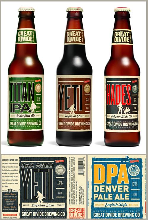
After living in New York for the last 6 years, everything seems less expensive when I go to my hometown in Delaware. We stopped by Atlantic Liquors in Rehoboth Beach to pick up a case of Dogfishhead IPA to bring home with us. While we were there we spotted a sampler pack of beers from the Great Divide Brewing Company, based out of Denver, CO. I know your not supposed to judge a book, or beer, by it’s cover, but this packaging just jumped off the shelf. So we decided to grab that along with our ol’ favorites. I just put a few in the fridge to enjoy tonight after work and I can’t wait to see if it tastes as crisp and cool as the design on the labels.
Sep
25
design
SKETCH LIKE A PRO or at least try
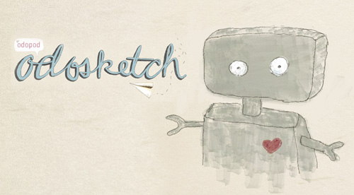
SInce the dawn of the internet, I have always loved those sites where you can sketch or doodle or be artistic in any-wich-way. Well there is a new site out there that blows them all out of the water. Odosketch by odopod. This flash based drawing site has the most realistic drawing mediums i have ever seen. It actually feels like you are drawing with pastels or watercolors. I also love that the background isn’t a plain white box, it’s a beautiful paper texture which makes everything pop a little more. I played around with it a bit this morning, and have to say I will definitely be back, a lot. So I hope you enjoy this little robot I sketched this morning, and then go sketch your own picture and enjoy the amazing work in the gallery.
Sep
21
design
JOSH BRILL’s modern field guide
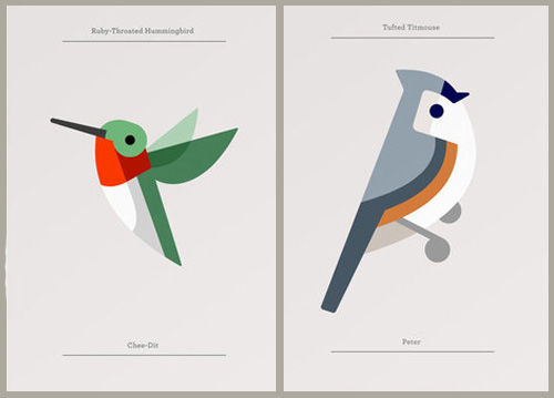
Who said nature illustrations had to be realistic? These limited edition prints from Josh Brill have a modern spin on the classic Audubon Society field guide illustrations. Its amazing that a few lines and color fields really do turn into perfect specimens of some classic birds. His unique modern edge to his drawing style is simplistic with out being cartoonish. But you better act fast, these are in limited editions of 50, and at $20 a pop they are going fast.
Sep
11
design
CAKE MAIL or why snail-mail is awesome
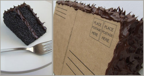
I would be so stoked to get this in my mail box. Oh that’s right this yummy piece of cake is the trump l’oeil of birthday greetings. Made from polymers, paint and cardboard this peice of cake can travel cross country in the mail. Well it does take a little more than .42 cents to get it there, but it’s worth it when you think of the smile it will bring to all the postal workers, and the recipient. I’m pretty upset that I found this after my sisters birthday last week, but you don’t have to make the same mistake. Go buy yourself some cake mail from TangBaby’s etsy shop before they blow out the candles.
Sep
09
design
ENTER TO WIN: a customizable insta-film brooch
I’m so thrilled to announce a new product up in the shop. Inspired by the classic instant film frames from days gone by. (we all miss you polaroid) This small acrylic brooch lets you wear your favorite photos, drawing, or even small notes. Made from 2 laser cut pieces of white acrylic it has a top loading slot to easily change out your mini-art as often as you want. These little pins are available in the peppersprouts etsy shop for $15.
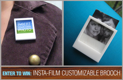
But here is the best part. I’m giving you the chance to win one for yourself. There are 3 ways to enter. the more you do the more chance you have to win. Winners will be announced Monday, September 14, 2009.
1. Visit the peppersprouts etsy shop and post in the comments below this post what your favorite item is.
2. Follow me on twitter!
3. Retweet this message on twitter “@peppersprouts Enter to win a polaroid inspired customizable brooch. RT this message to be entered to win”
GOOD LUCK!!!
Sep
08
design
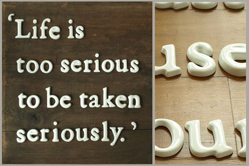
CERAMIC TYPOGRAPHY from a silver garden
As you probably know already I really love good typography! Which is probably why these ceramic letters from a silver garden caught my eye this weekend, not to mention their photographs are fantastic. They are currently available with a few different sayings, but I’m positive that they are going to grow very quickly. The best thing about these little letters is you can space them however you want, DIY kerning, and they can be used indoors and out. How cute would these be as your next housewarming gift.
Aug
28
design
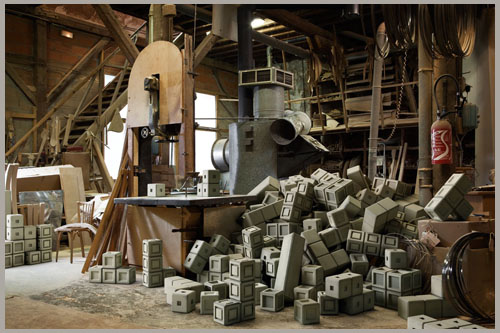
VIDEO GAME FACTORIES: fact or fiction?
Just wanted to leave you with some eye candy for the weekend. Where are video games produced? In a dark room by a bunch of programers or in dusty old factories by craftsman with years of experience? These photos from French agency Amusement wonders just that. Below is the tetris factory, but check out some other video game factories by visiting their site.
Aug
20
design
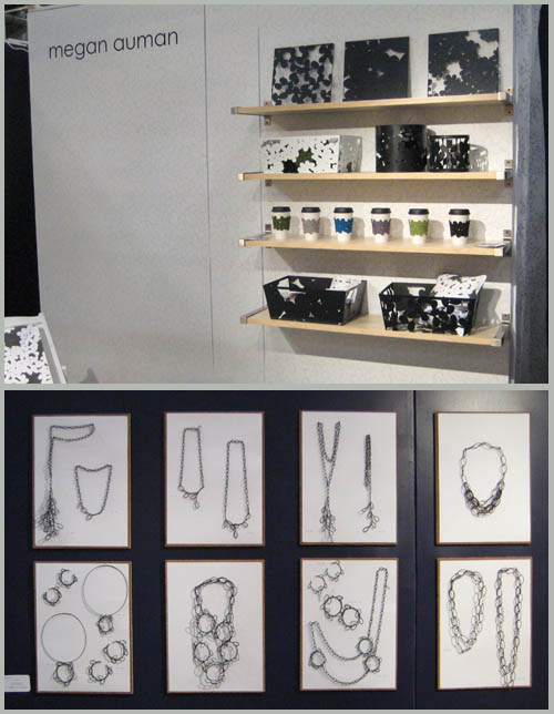
THE BEST OF NYIGF – megan auman
I have been a fan of Megan Auman’s work for quite a while. Not only are her designs beautiful, she is a really wonderful person as well. I was very happy to run into her at the NYIGF this year and her booth really stood out to me. First off I love her name placement, the whole setup felt like you were in an art gallery or a museum store’s special artist section. All of her designs felt very prominent and stood out against her custom designed backdrop that also featured her signature leaf pattern. Her booth design was very open and had room to walk around and really take in her work which was a welcome change from only being able to stand in one spot and glance around. On the side wall she proudly showcased her jewelry line, hung upon little white canvases. This really highlighted the artistic quality of the pieces, jewelry as art not just adornments. I really can’t wait t see what is next from this very talented lady.
Aug
19
design
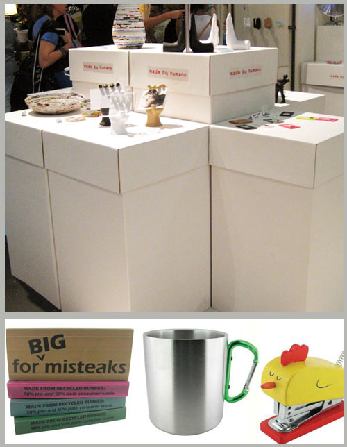
THE BEST OF NYIGF – made by humans
Continuing on our NYIGF adventure, I really liked the Made By Humans booth. They had a prime spot on the end cap near the middle of the gift fair. I believe they had a double wide space (it seemed huge) and they used it to its full potential. There were no walls or curtains at the made by humans booth which made it very easy to walk through their plethora of cardboard pedestals.
They also covered their area in a puzzle like rubber flooring reminiscent of a children’s play room which provided some much needed relief for my sore feet by that point in the day. This booth had a great use of space and was able to have multiple buyers looking at different products without feeling like they were on top of each other. That goes a long way in my book.
Aug
18
design
THE BEST OF NYIGF – suck uk
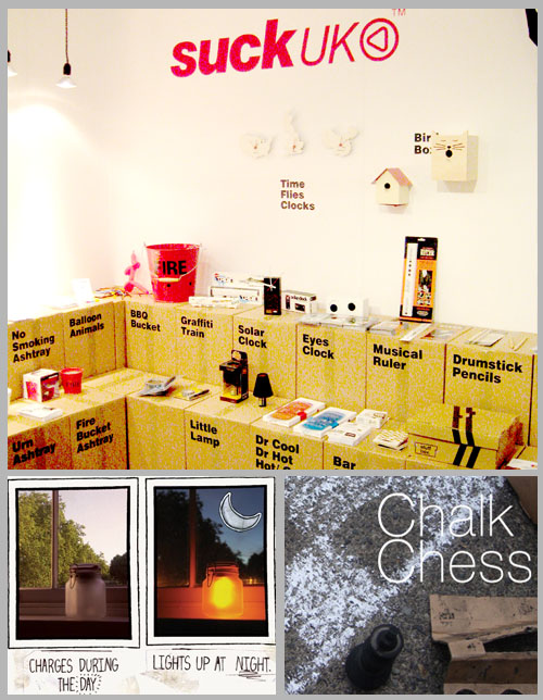
You probably have seen a few of Suck UK’s products before, but may not have known the company’s name. Their goods are stocked at a few small shops like urban outfitters, fred flair, target, you know just the small mom and pop shops really. Of course I’m kidding Suck UK is HUGE. You remember the sunjar, yeah that was theirs.
I really loved their booth at the 2009 NYIGF. It was simple and straight to the point. Everything was clearly labeled but it didn’t feel academic at all. Their setup was another that clearly let the products stand up for themselves without the bells and whistles of flashy signs or over-the-top decor. I also really liked that everything was placed against the wall and was easy to lance at while still standing in the aisle. With so many different products this layout and booth design made all of their products seem like they were as worthy as what was sitting next to them, there was no “hot item” to be purchased. Everything they do is so well designed that nothing seemed to be outranking anything else.
