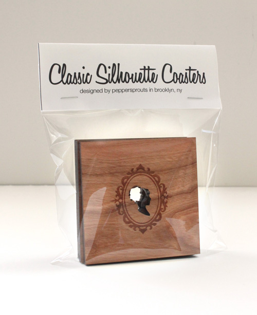
When I started peppersprouts back in 2009 I had no idea what I was doing. I really liked making things and loved that people were interested in buying what I was making. But of course, you need to have some sort of packaging for your work to be displayed in. I couldn’t use a belly band or tie my coasters up with string because the most important aspect of my very first coaster design was right in the center of the coaster. So I decided the best (and least expensive) way to package my coasters sets would be in a clear cello bag with an informational tag stapled to the top, as seen below.
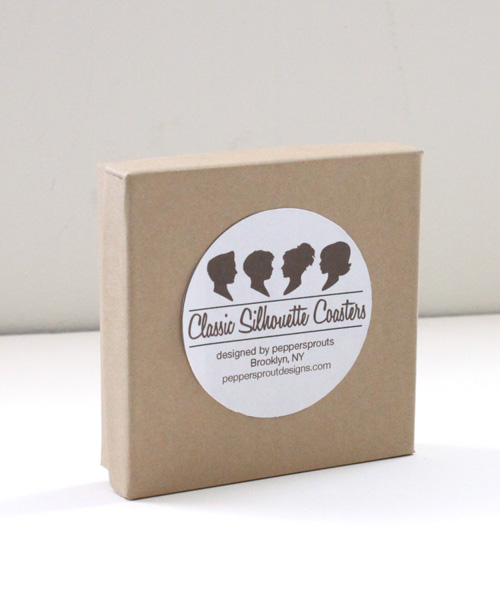
I knew this was pretty bare bones packaging. It was functional but not even a little bit appropriate for a store shelf. I decided they needed to be in some sort of box. While I no longer have the original kraft paper boxes I chose to use, this photo pretty much sums up the look and feel of the next iteration of packaging—super boring. Unlike the cello bag, you can no longer see the items inside the box, plus I had to stuff the box with tissue paper to make sure the coasters didn’t rattle inside the boxes. Not really ideal.
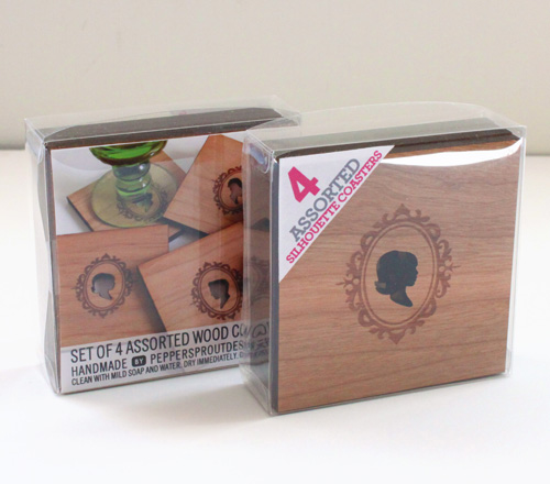
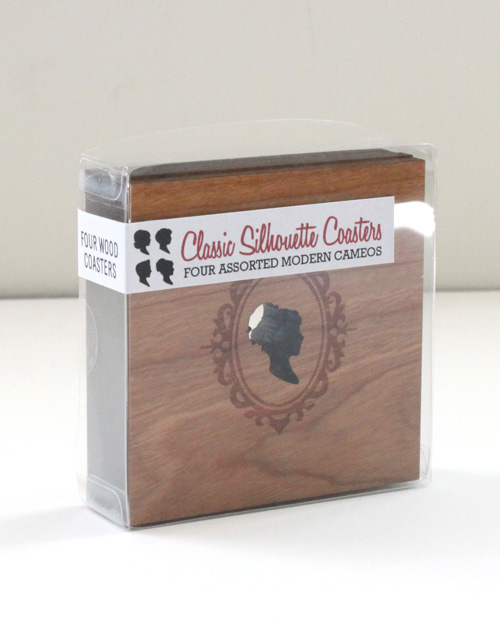
I thought for a while, did a little research and decided I really needed a clear box. A box where you could see the beautiful designs held within. I lucked into finding a box that worked perfectly for my coasters. It was intended to be for wedding favors and was available in bulk. Perfect! The first label I used was a wrap around sticker, so tere was a bit of information about the coasters whichever way you looked at them. I thought this new packaging idea was awesome. But after using it for about 6 months I decided it needed a little facelift as well.
So I changed it up a bit. I kept the box. Color coded an exciting triangle label for each kind of coaster design (house, sillo, chairs) and added an information sheet inside the package so you could see the coasters in action; a sort of beauty shot to add some pizzaz to the overall presentation. I have been very happy with this packaging for the two years. You can see what you are buying, you get all the important information about the coasters and it stands up on its own. What more I could I really ask for? Then I started thinking: What if you could touch the coasters? What if you could take them out of the box and look at them without ruining the packaging? After all, these clear boxes were closed up with little circle stickers on the sides.
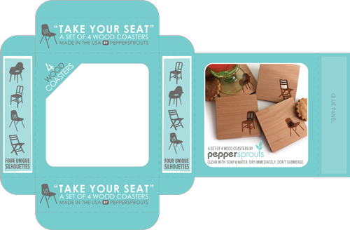
I dug out my copy of the packaging Designers Handbook, and designed a box layout to hold my creations.I reached out to a number of printing companies who sent me personalized quotes and samples of packages they have printed in the past. I wanted to make sure I was going to be able to afford to print my own packaging before I started to fully design them. I fell in love with the branding, samples and awesome personalized attention I recived from Oliver Printing Co. This crazy idea was a go!
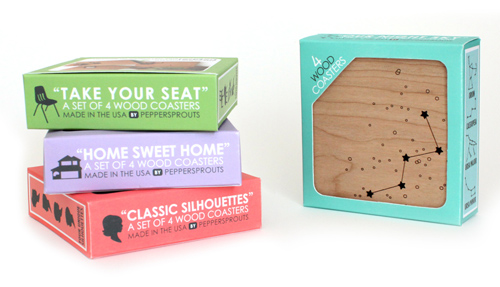
I started designing this new little box. I added a cut out window on the front so you can touch the wood. The side panels show the silhouettes that are inside since each coaster is different. I decided on unique colors for each different coaster design, so they stand out from eachother at shows and on store shelves. And I kept the beauty shot of them on the back along with care information.
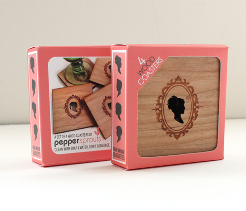
I am so excited to finally share with you the brand new packaging that now accompanies Peppersprouts wood coasters. It was so much fun making this project come to life, and I really couldn’t be happier!
