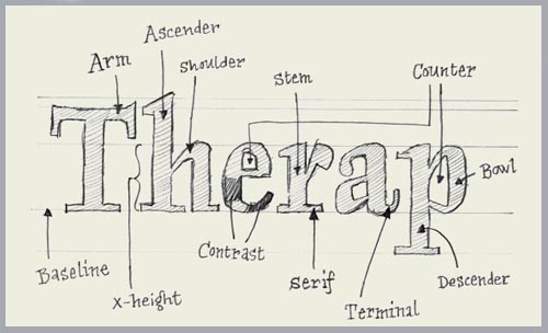
Phew it’s been a busy week around the office, complete with freelancers, computer problems, and a quick trip to the New York Times. With that being said I have been doing a lot of thinking lately about inherent knowledge that I take for granted.
I’m teaching a introduction to Adobe illustrator class in March and have been trying to unlearn things and break down the program into simple basics. One of the things I use illustrator for is manipulating fonts, so I’ve been looking for some font basics so that the class will know what I’m talking bout with words like counter, kerning, descender and baseline. Well, thanks to the lovely people over at typeworkshop.com I have a great place to send everyone. Their blueprint-style drawings of typographic characters explain basic terminology, letter spacing (kerning is correct word), and almost anything else you want to know about typography in a simple visual format. Check them out and learn something new today, you could be on your way to designing your own typeface.


